I was tasked with creating a completely new website and design concept for Hovedstadens Enterprise.
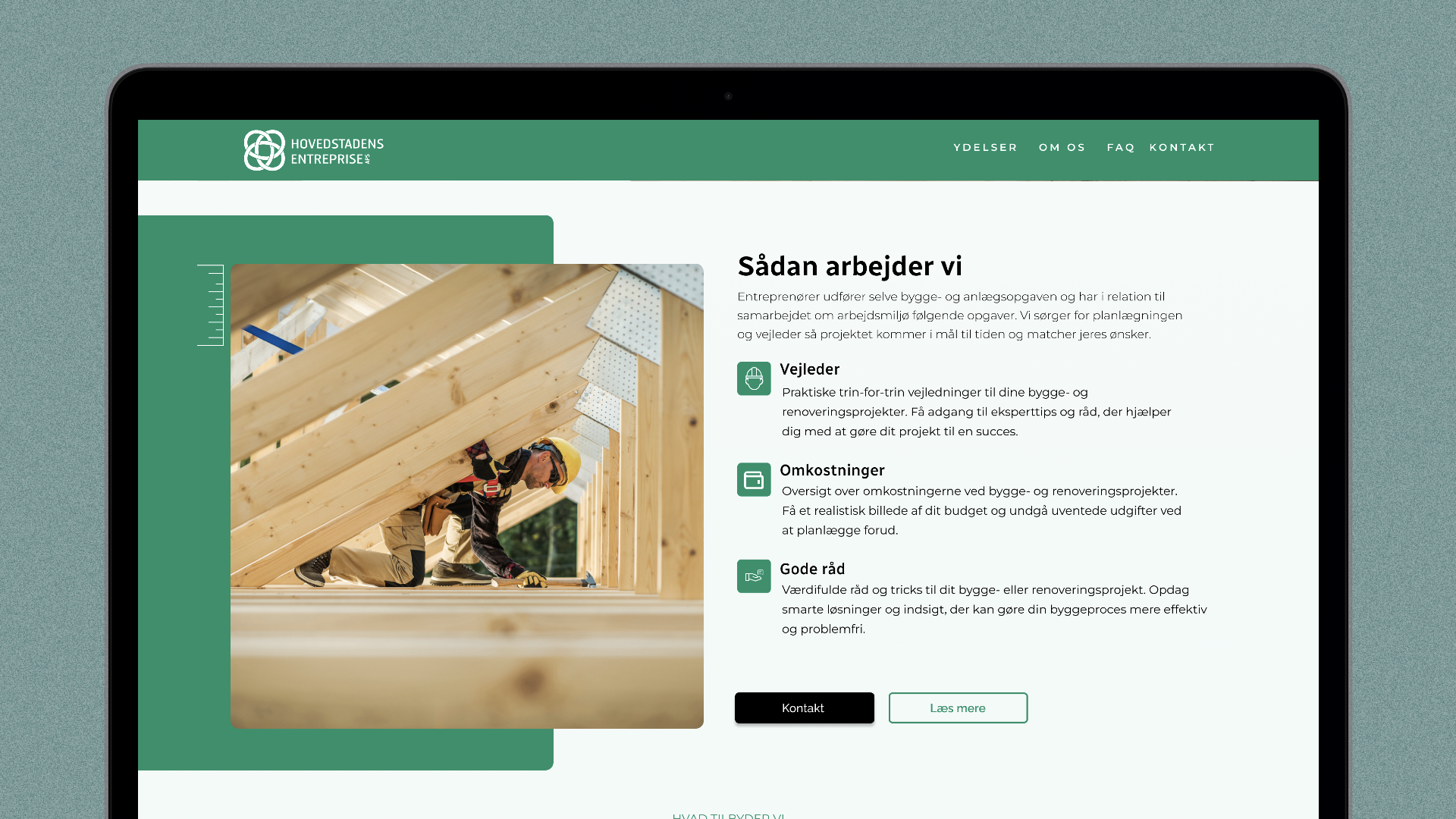
With no specific design guidelines provided by the client, I took the initiative to propose two distinct design directions: one more serious and professional, and the other more memorable and lively, aiming to capture the brand’s essence in different ways. The client ultimately chose the bolder, more colorful, and lively option.
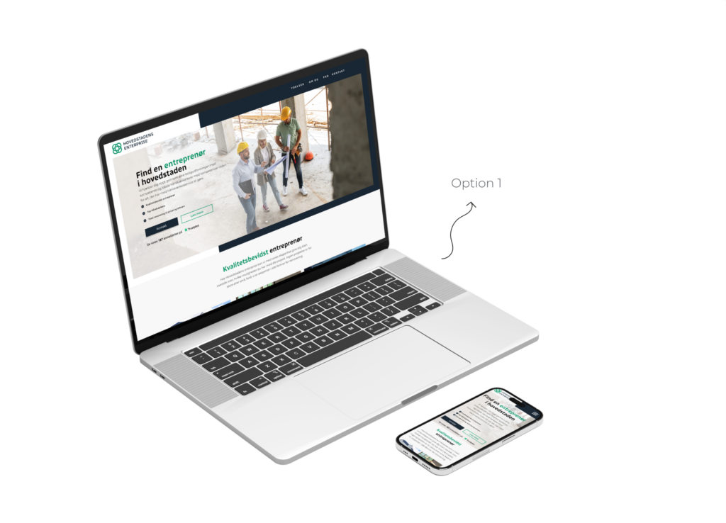
In comparison, Design 1 was more minimalist, featuring dark blue and green as a contrast. It focused on results rather than process and had a sharper, more professional aesthetic with clean lines and angular elements.
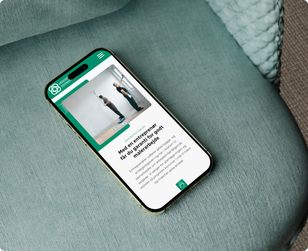
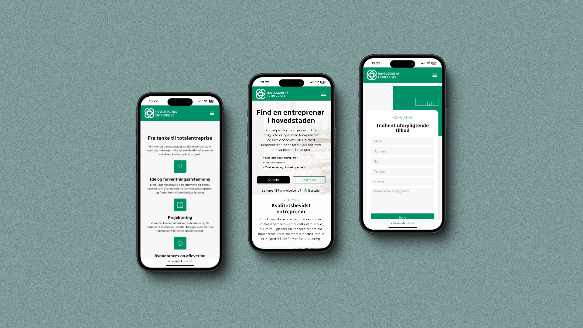
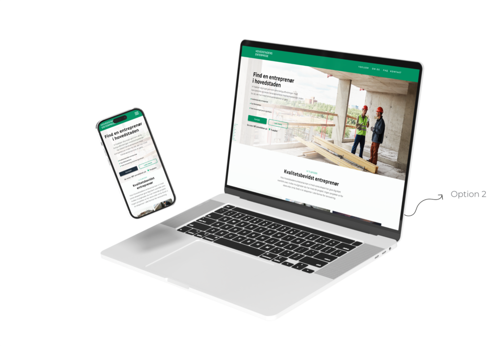
The client chose Design 2, which uses your green color more prominently to create a vibrant, cohesive look across the site. This design emphasizes USPs and the value proposition, with images focused on the process and consumer engagement. Elements like rulers and green boxes add visual interest and help reinforce brand recognition.